Human interface guidelines#
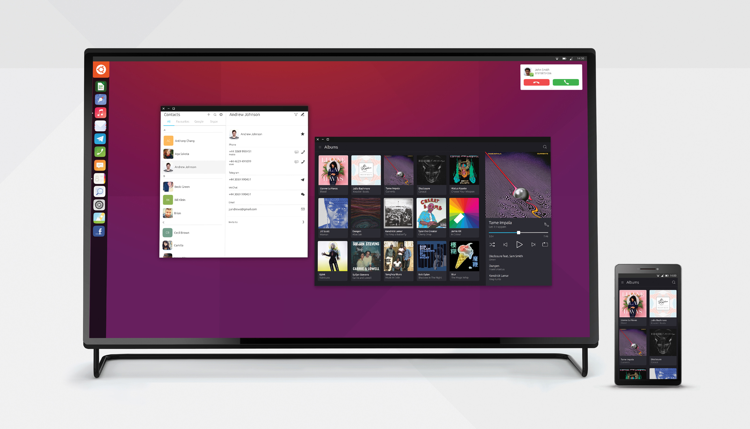
Ubuntu Touch follows a modern and convergent design philosophy called Suru. We aim to keep developing the design started by Canonical.

Suru meaning#
Here at UBports we believe that everyone should have access to free, reliable, and trusted software that can be shared and developed by anyone. This has paved the way to allow the community to grow and prosper with freedom trust and collaboration. This integral belief has been translated into the design philosophy called Suru.
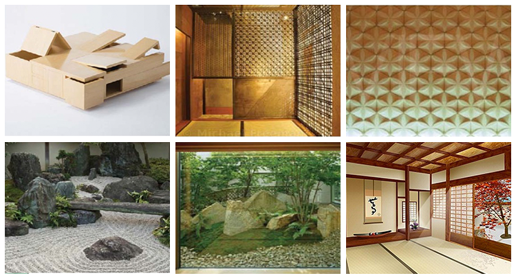
Suru items from the Ubuntu values alluding to Japanese culture.
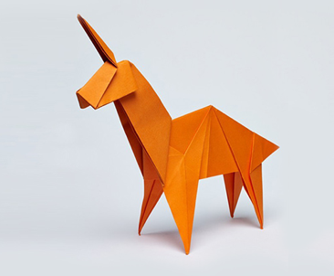
The design of Suru is inspired by origami, because it gives us a solid and tangible foundation.
Paper can be used in all areas of the design in two and three dimensional forms, because it is transferable and diverse.
Translated in design#
Suru brings a precise yet organic structure to the Ubuntu Touch interface. The sharp lines and varying levels of transparency evoke the edges and texture of paper. All elements are placed deliberately, with the express aim of being easy for the user to identify and use.
When using a small layout, the information and functionality is folded into a compact object that can be refolded to expose different areas. As the layout size increases, the object can become progressively larger, allowing more of the information and functionality to be exposed at any one time.
Origami#

Origami has long been associated with good fortune and represents the visual style for Ubuntu Touch. Origami folds are used to define the design.
Simple details#

What is most important is that screen layouts retain a natural, rhythmic quality, and a neatness and clarity that helps the user find things quickly and use them intuitively.
Using subtle grids for accuracy#
The folds from origami produce simple graphical details that allow designers to create a subtle grid for positioning brand elements and components, such as logos, icons or copylines. This helps maintain focus on the main image or graphic element.

Suru mood board#
Influences and inspiration#
