App icon design#
The whole system and apps follow the Suru design principles started by Canonical and Samuel Hewitt.
Design Philosophy and Suru Meaning#
Suru alludes to Japanese culture.
The design of Suru is inspired by origami.
Paper can be used in two and three dimensional forms, because it is transferable and diverse.
Suru brings a precise yet organic structure to the Ubuntu Touch interface. The sharp lines and varying levels of transparency evoke the edges and texture of paper.
Design Tips for an App Icon#
Descriptive design#
The icon you choose for your app should describe what your app is about, what it does, or what service it is there for in a recognizable way.
Distinctive shapes#
Depending on the object you choose to show in the icon, on the perspective, lighting and other factors, it might be hard to recognize what you are trying to depict. A TV might look like a box, or a computer screen, a remote control like a phone, etc.

Details#
A detailed icon is very nice to look at as it shows quality and your eye for the small things. It might add confusion though, especially in smaller sizes or for people who have impaired eyesight. Show what’s necessary, pay attention to detail, but don’t overload the icon.

Colours#
Use distinctive colours, make your icon stand out a bit and give the shapes enough contrast to be visible.
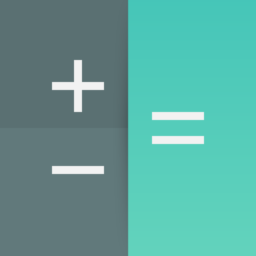
Gradients#
If you were to add a gradient to your icon, only use colours that are slightly different from each other so that the change is not too dramatic. For example:
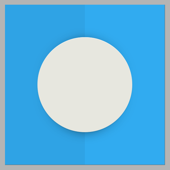
Composition#
Suru icons are composed of simple geometric shapes. The background is usually a coloured surface with the pictogram, also composed of flat shapes, “floating” above it.

The Fold Effect#
In keeping with the origami motif, some Suru icons have an implied fold. In many icons this is a single horizontal or vertical line but sometimes the fold line(s) correspond or align with elements of the pictogram.
The fold is drawn by creating an overlay of a white or black polygon of very low opacity (usually between 1%~10%).


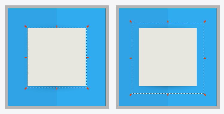
Grids#
Using a grid layout ensures consistency across all icons and will force you to reserve area for the icon background for even padding around the pictogram.
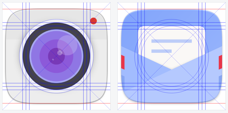
Note that the circular elements are slightly larger than rectangular elements of the grid, this overshoot is needed to compensate for the optical illusion where circular objects appear smaller than rectangular objects of the same dimensions.
Unit Grid#
Designing with an overall pixel grid in mind is crucial to having crisp, clean icons. Since most desktop icons have dimensions that are a factor of four (16x16, 24x24, 32x32, 48x48, 256x256) using a pixel grid with lines every 4 pixels and drawing to that grid is the best practice.
Shadows#
Often a Suru icon is drawn with two distinct sets of shadows, one for the pictogram to create a drop shadow effect, and a second below the overall icon shape.
The drop shadow effect on the central pictogram is a combination of two shadow that are identical in shape to the pictogram:
a shape that is rgba(0,0,0,0.1) with vertical offset of 2 pixels and a blur of 1%
a shape that is rgba(0,0,0,0.4) with vertical offset of 4 pixels and a blur of 10%
If the fold effect is present, the second shadow is drawn using a linear gradient with three stops whose positions correspond to the location of the background fold.
Highlights#
Pictograms have an ever~so~slight (1 pixel) white highlight along the top edge of them. To do this, make 2 solid white copies of the main pictogram shape and move one copy 1 pixel down and ‘difference’ the two so what’s left is an ‘edge’ that you can align to the top of the pictogram. Repeat as needed.
Depending on the colour of your pictogram element, you can vary the opacity of your highlight. For instance, if it is using bright, primary colours, there isn’t any need for a highlight.
Grids and other resources can be found in this gitlab repository.