Dialogs#
A dialog is a way of informing the user about important notices or letting them complete a single action.
Dialogs should be unambiguous and concise in their wording. Only the most common, or main, action should be highlighted with color. The main action should be placed topmost in vertical dialogs or rightmost in horizontal dialogs.
Main actions may be positive, negative, or neutral. Positive actions add something to their subjects. Negative actions remove, delete, or otherwise make changes that can’t be easily undone. Neutral actions do not add or remove from the subject, but still make a change.
The main action should be highlighted using theme.palette.normal.negative if it is destructive, theme.palette.normal.positive if it is positive, or theme.palette.normal.focus if it is neutral. The remaining options should be gray, without defining a color theme property.
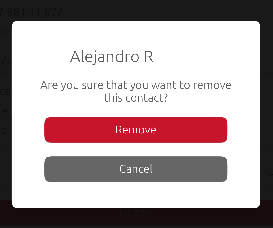
Dialogs should resume actions, not ask a yes or no question. For example, the user has selected an option to delete a contact. Your dialog should ask, “Are you sure you would like to delete this contact?” The options should then be “Delete”, a negative action colored in red, and “Cancel”, colored in gray.
Examples of designs to avoid#
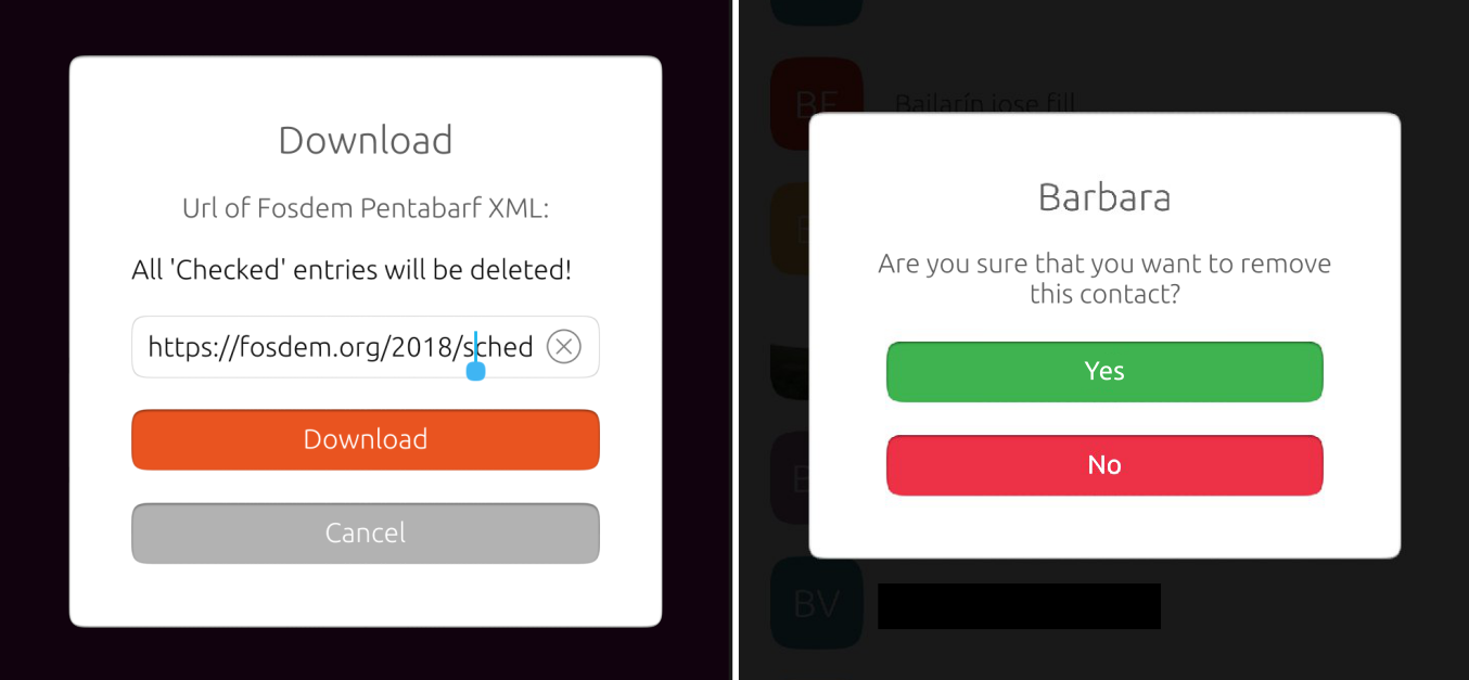
Left: Download button uses old focus color, Cancel button (secondary action) uses old grey color.
Right: Dialog uses generic answers, both buttons colored as main actions with confusing color meaning: “Will ‘No’ cause an irreversible action, and ‘Yes’ cause an additive action?”